
This website utilizes the emerging “Responsive Design” trend in website design. The idea is to create websites such that they will “re-flow” and respond when viewed on different sized devices. To see this in action, drag the side of your browser window to a narrower width or switch your ipad from horizontal to vertical orientation.
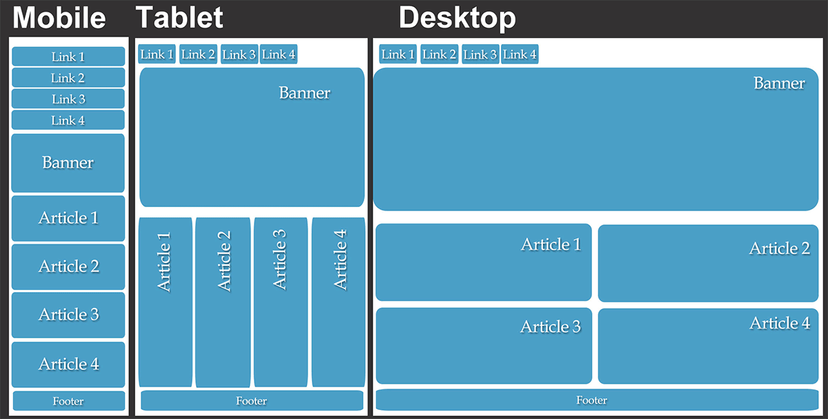 Websites are being viewed on an ever expanding variety of devices. Smart phones, tablets, desk top monitors and many other sources are being used by site visitors. These devices can be used in vertical or horizontal orientation and have varying resolutions. Many people do not have the size of the browser maximized. There is an almost infinite and expanding variety of website viewing configurations.
Desk top browsing will be with us for many years to come. However, mobile browsing is expected to outpace desktop-based access within three to five years. Rather than make different sites and different style rules for an ever expanding universe of viewings conditions, Responsive Design strives to allow one design to adapt to all devices. This is fast becoming the standard in an increasingly mobile device enabled world.
Read more about Responsive Design in this article from A List Apart or a more condensed explanation in this Mashable article.
Open Range Imaging has invested in and embraced this new design trend. We are committed to offering the most up to date and mobile ready sites.